Will Warsh Scrap the Fed Dot Plot? June 17
6/14/2026
The Fed dot plot has guided markets since 2012, but new Chair Kevin Warsh may kill it at his very first meeting on June 17. Here is what scrapping the dots would mean for stocks, bonds, and your portfolio.

What Is the Fed Dot Plot?
The Fed dot plot is a simple-looking chart that carries enormous weight. Each dot represents one Federal Open Market Committee (FOMC) official's projection for where the federal funds rate should sit at the end of the next few years and over the longer run. With up to 19 participants placing a dot anonymously, the chart turns a private debate into a public picture of the Fed's expected rate path.
The Fed began publishing the dots in January 2012, as part of the quarterly Summary of Economic Projections (SEP). The economy was crawling out of the 2008 financial crisis, rates were pinned near zero, and the Fed wanted to reassure markets that policy would stay easy. The median dot quickly became the headline number every trader watches.
How the dot plot actually works
- Frequency: released four times a year, after the March, June, September, and December meetings.
- Anonymity: no dot is tied to a named official, so you see the range of opinion but not who holds it.
- The median rules: the middle dot for each year is treated as the Fed's "official" forecast, even though it is just a snapshot of opinion, not a promise.
- It is a forecast, not a commitment: the Fed stresses this constantly, and markets ignore it constantly.
That last point is the heart of the controversy. The dots are meant to be flexible guesses, but markets treat the median like a signed contract. When reality diverges from the dots, the repricing can be violent. For a deeper primer on how the central bank's balance-sheet tools interact with rate policy, see our guide to quantitative tightening (QT).
Who Is Kevin Warsh, and Why Does He Hate the Dots?
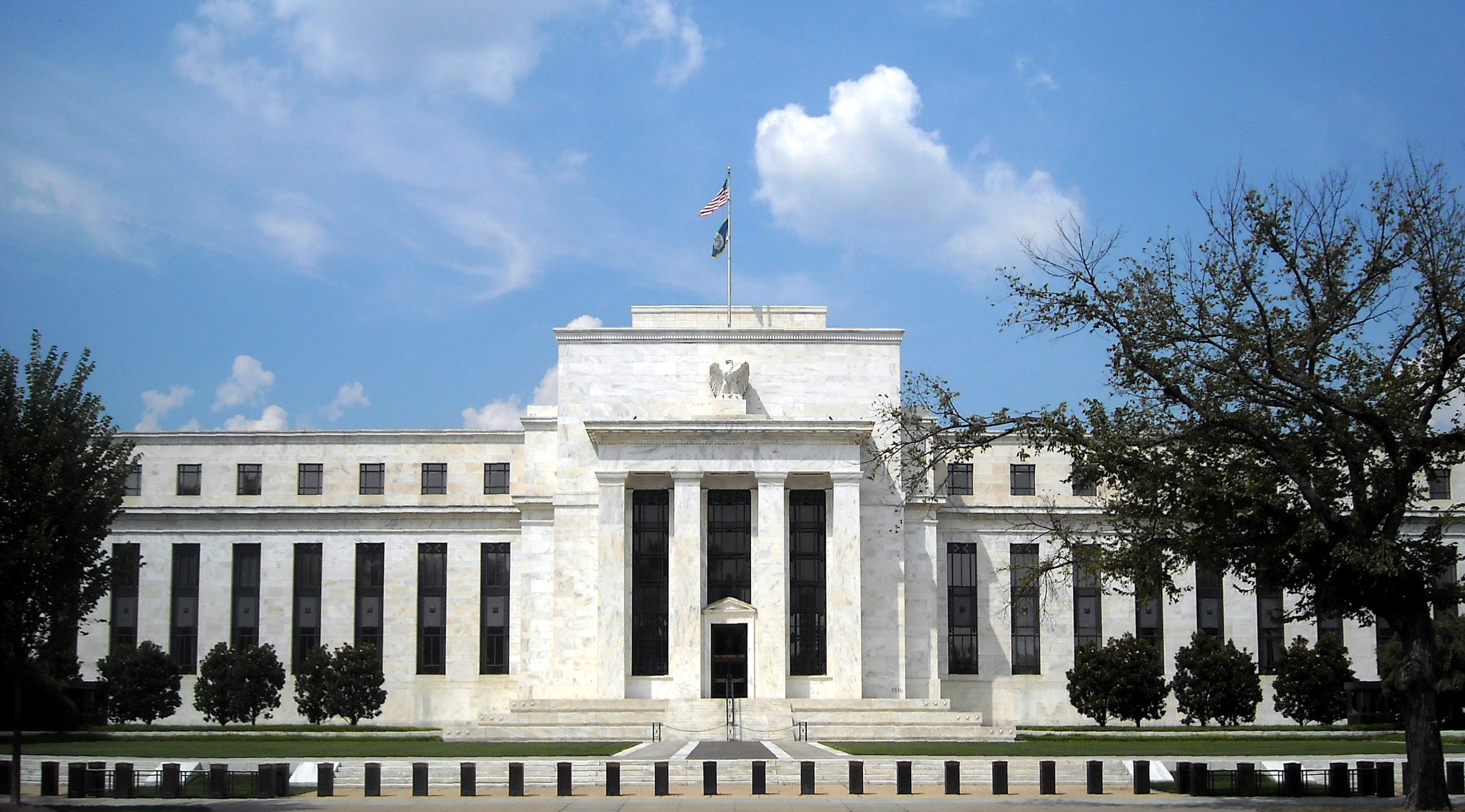
Kevin Warsh is not a newcomer to the Fed. He served as a Fed governor from 2006 to 2011, living through the financial crisis from inside the building. He was sworn in as Fed Chair on May 22, 2026, replacing Jerome Powell, and he arrives with a clear, long-held agenda: less forward guidance, less hand-holding, and more flexibility for policymakers to react to data.
Warsh has been blunt. He argues that officials "hold on to those forecasts longer than they should," and he has repeatedly called forward guidance a "straitjacket" that forces the Fed to commit to a path the data may not support. In his telling, the dot plot is the worst offender because it converts a flexible projection into what markets treat as a firm rate commitment.
A return to the Greenspan playbook
Ironically, Warsh says he wants to emulate Alan Greenspan, who chaired the Fed from 1987 to 2006. In the early Greenspan years, the Fed did not even announce its rate decisions; traders had to infer policy from the central bank's money-market operations. Warsh sees that opacity not as a bug but as a feature, a way to keep markets focused on the data rather than parsing every Fed dot. Critics counter that the entire modern history of the Fed has moved toward more transparency, not less.
Why Would the Fed Scrap the Dot Plot?
This is the question dominating Wall Street desks ahead of June 17. The case for killing the dots rests on three arguments that Warsh and his allies make repeatedly:
- The dots become anchors. Once published, a median dot tends to "stick," and officials are reluctant to move away from a forecast they have already broadcast, even when conditions change.
- Markets misread projections as promises. A flexible guess gets priced as a commitment, so when the Fed deviates, the gap triggers outsized volatility in bonds and equities.
- Forward guidance contributed to policy errors. Warsh points to episodes where the Fed felt constrained from adapting quickly because it had pre-committed to a path.
The case against scrapping the dots is just as forceful. Former St. Louis Fed President James Bullard warned that ditching the dot plot would breach an "international standard" followed by major central banks. Economist Claudia Sahm said she "almost fell out of my chair" at the idea, warning it could undo two decades of progress on Fed transparency. Less information, the critics argue, does not reduce uncertainty; it just leaves markets to guess.
| Argument | Pro-scrap (Warsh) | Pro-keep (critics) |
|---|---|---|
| Flexibility | Frees the Fed to react to data | Removes a useful expectations anchor |
| Volatility | Stops markets treating dots as promises | Less guidance means bigger surprises |
| Transparency | Greenspan-era focus on data, not dots | Reverses 20 years of openness |
| Global norms | The Fed can lead a rethink | Breaks an "international standard" |
What Happens at the June 17 FOMC Meeting?
The FOMC meets June 16-17, 2026, with the decision and press conference landing on Wednesday, June 17. Three things make this meeting unusually important:
- It is Warsh's debut. His first meeting and first press conference as Chair. Traders will parse his tone as closely as the decision.
- It is an SEP meeting. June is one of the four quarterly meetings that normally include updated economic projections and the dot plot, which is exactly why scrapping the dots here would be so symbolic.
- The bias may flip. Officials are expected to shift from an easing bias toward a neutral stance, a meaningful change in the Fed's posture.
If you want the AI-generated macro context heading into the decision, you can read today's market intelligence report on Finance Halo's dashboard, which tracks the macro setup, sector positioning, and sentiment in one place.
| What to watch on June 17 | Base case | Why it matters |
|---|---|---|
| Rate decision | Hold at 3.50-3.75% | 98-99% priced; a surprise would be a shock |
| The dot plot | Could be erased or scrapped entirely | The headline structural story of the meeting |
| Policy bias | Shift from easing to neutral | Signals fewer or zero cuts ahead |
| Press conference | Warsh's first as Chair | Tone sets the template for the Warsh era |
The Rate Decision: A Hold With a Hawkish Tilt
Start with what is almost certain: the Fed is overwhelmingly expected to hold rates at 3.50-3.75%. CME FedWatch and prediction markets put the odds of no change at roughly 98-99%. The drama is not in the level; it is in the signal.
The bigger story is the hawkish drift. The probability of at least one rate hike by year-end 2026 has climbed to about 70%, up from near zero at the start of the year. That is a remarkable repricing, and it reflects sticky inflation plus a new Chair who is openly skeptical of cutting. A Fed that is debating hikes rather than cuts changes the math for every rate-sensitive asset, from growth stocks to homebuilders.
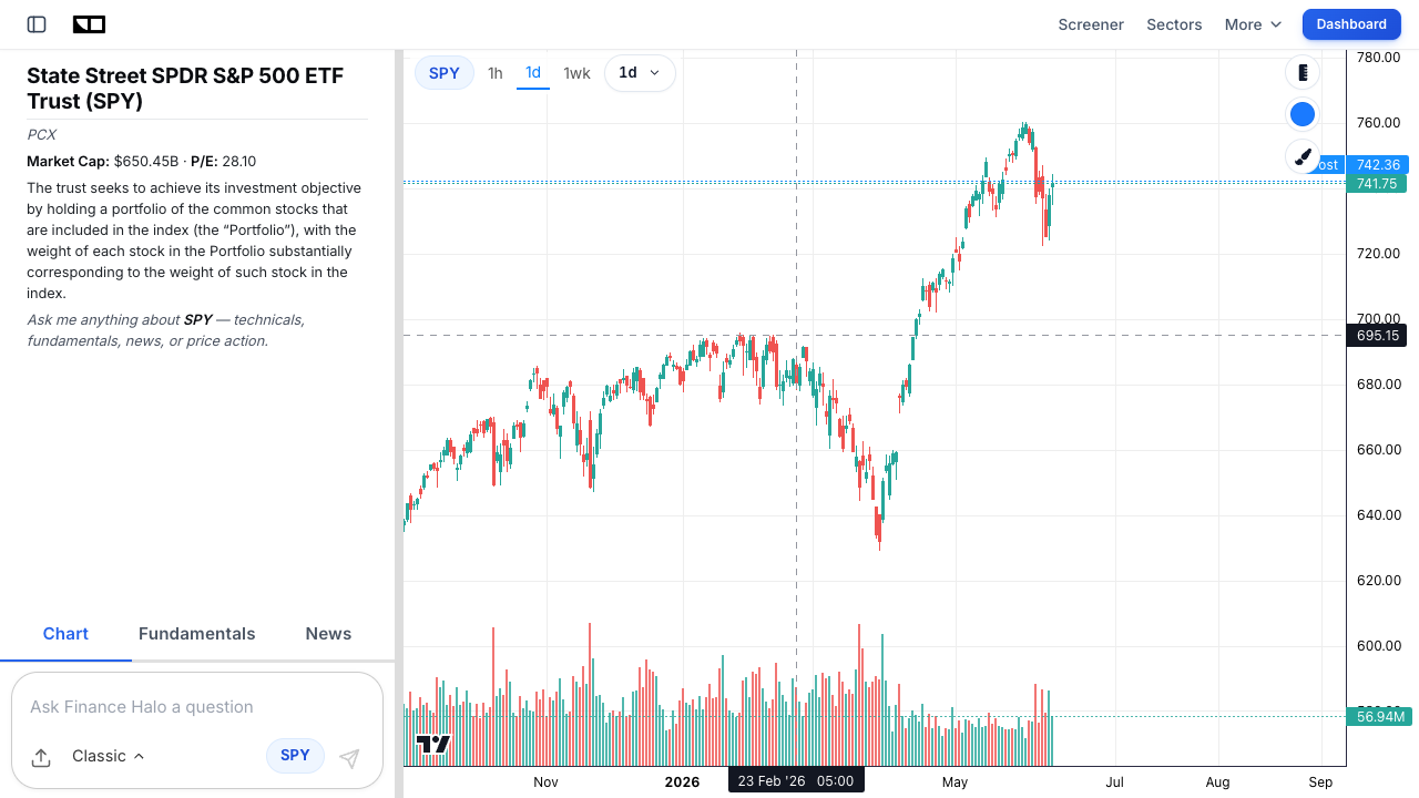
To see how the broad market has traded into this setup, here is the S&P 500 via the SPY ETF chart on Finance Halo:
How Would Markets React to a Dot-Plot Death?
Removing the dot plot does not change a single interest rate on its own. What it changes is information. Markets would lose the single clearest signal of where a majority of policymakers expects rates to go. The likely result is a wider range of outcomes priced into bonds and equities, which usually means more volatility, not less.
Think of it this way: when the Fed hands you a roadmap, you can argue about the destination but you broadly agree on the route. Take the roadmap away and every data release, every speech, and every press conference becomes a bigger event because there is no baseline to anchor to. That is great for traders who thrive on volatility and uncomfortable for long-term investors who dislike surprises.
Sentiment tends to swing hard around these inflection points. The live Fear & Greed gauge below is a quick read on whether the market is complacent or fearful heading into the decision:
The three scenarios for June 17
- Scrap the dots outright: the boldest move. Expect an immediate jump in implied volatility as markets digest a guidance-free Fed.
- Erase the last cut, keep the dots: a softer step that nudges the median higher and reinforces the hawkish narrative without the structural shock.
- Hold the line, signal change is coming: Warsh keeps the dots for now but uses the press conference to telegraph that the format is on borrowed time.
Real-World Example: The 2013 Taper Tantrum
To understand why a communication shock matters, look at the 2013 taper tantrum. It is the cleanest example of markets violently repricing when the Fed's message shifted.
In May 2013, then-Chair Ben Bernanke hinted that the Fed might slow its bond purchases. He did not raise rates. He did not even commit to a timeline. He simply suggested a taper was on the horizon. The reaction was brutal:
- The 10-year Treasury yield rose from 1.94% on May 21, 2013 to 2.03% the next day, then kept climbing to 2.96% by September 10.
- Between April 30 and July 5, 2013, the 10-year yield jumped more than 100 basis points.
- The overnight indexed swap market went from pricing under 25 basis points of hikes over two years to as much as 130 basis points, because traders wrongly assumed tapering meant imminent rate hikes.
The lesson is direct: when markets lose a clear Fed signal or misread a new one, they overshoot. A dot-plot death is a different trigger than a taper hint, but the mechanism is the same. Less clarity, bigger moves. Investors who understand the difference between a normal pullback and something worse can keep their heads, our explainer on a correction versus a bear market breaks down the thresholds.
Winners and Losers if Forward Guidance Disappears
A more hawkish, less predictable Fed reshuffles the leaderboard. Here is a rough map of how different assets tend to behave when guidance shrinks and rate-hike odds rise.
| Asset / Group | Likely reaction | Why |
|---|---|---|
| Long-duration Treasuries (e.g. TLT) | Pressured | Higher-for-longer rates hurt long bonds most |
| Growth and tech stocks (QQQ) | More volatile | Valuations lean on low discount rates and clear guidance |
| Banks and financials | Mixed to positive | Can benefit from higher rates and a steeper curve |
| Gold (GLD) | Supported | Hedge against policy uncertainty and volatility |
| The US dollar | Firmer | Hawkish Fed and higher real yields attract flows |
| Cash / short-term bills | Attractive | Paid to wait while uncertainty is high |
None of these are guarantees. They are tendencies that hold when the Fed leans hawkish and the rate path gets murkier. If you are worried about a volatility spike around the decision, our playbook on hedging a portfolio against risk covers the same defensive toolkit, gold, Treasuries, and cash, that applies to a policy shock.
What Would Replace the Dot Plot?
If Warsh removes the dots, the obvious question is what fills the vacuum. He has not published a blueprint, but his public comments and the Greenspan analogy point to a few possibilities:
- A narrative outlook. A written or verbal description of the policy stance and the risks, without numeric rate projections.
- Scenario-based guidance. Conditional "if-then" framing ("if inflation does X, we expect to do Y") rather than a single path.
- Greater reliance on the press conference. More emphasis on the Chair's tone and Q&A, less on the published forecast grid.
- Less guidance, full stop. The most radical option, letting incoming data, not Fed signals, drive expectations.
Whatever the format, the direction of travel is clear: the Warsh Fed wants markets leaning on the data, not on a chart of dots. For investors, that raises the value of doing your own homework. A disciplined process for reading a company or an index on its own merits, like the one in our guide on how to analyze a stock before buying, matters more when the Fed is offering fewer hints.
How to Position Your Portfolio for June 17
You cannot control what Warsh says. You can control your exposure and your process. Here is a practical, step-by-step approach into the meeting.
- Map your rate sensitivity. Know which of your holdings are most exposed to higher-for-longer rates, typically unprofitable growth stocks and long-duration bonds.
- Stress-test for a volatility spike. Ask what a sudden 100-basis-point move in yields, taper-tantrum style, would do to your portfolio.
- Keep some dry powder. Cash and short bills pay you to wait and give you ammunition if the decision triggers a selloff.
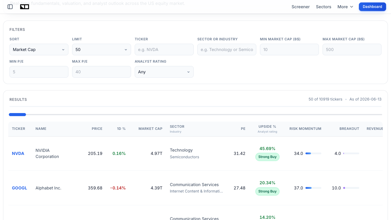
- Screen for resilience. Favor quality balance sheets and reasonable valuations over speculative names. You can filter for exactly that on the Finance Halo market screener.
- Watch sector leadership. A hawkish surprise usually rewards value and defensives over high-multiple growth. Track the rotation in real time on the sector performance page.
None of this requires predicting the Fed. It requires being prepared for a wider range of outcomes, which is precisely the point of a guidance-free regime. For broader context on how a sticky-inflation, slow-growth backdrop can squeeze portfolios, see our 2026 guide to stagflation.
Common Mistakes to Avoid
- Treating the dots as a promise: the dot plot was always a forecast, not a commitment. Investors who bet the farm on the median dot have been burned before. Fix: treat any Fed projection as one scenario among many.
- Trading the headline, not the substance: "Fed holds rates" can hide a hawkish bias shift that matters far more than the level. Fix: read the statement and the projections, not just the rate number.
- Assuming a hold means calm: June 17 could pair a non-event rate decision with a structural shock to communication. Fix: prepare for volatility even if rates do not move.
- Over-leveraging into the meeting: a guidance shock can whip both directions. Fix: size positions so a taper-tantrum-style move does not force you out.
- Ignoring duration risk: higher-for-longer hits long bonds and unprofitable growth hardest. Fix: know your portfolio's rate sensitivity before, not after, the decision.
- Panic-selling on the first move: initial post-FOMC reactions often reverse within days. Fix: have a plan written down before the announcement so you are not reacting emotionally.
Frequently Asked Questions
What is the Fed dot plot in simple terms?
It is a chart where each FOMC official marks a dot for where they think the federal funds rate should be at the end of upcoming years. The median dot is treated as the Fed's expected rate path. It is published quarterly as part of the Summary of Economic Projections and has guided markets since January 2012.
Is Kevin Warsh really going to scrap the dot plot on June 17?
It is possible but not confirmed. People familiar with his thinking say he could move as early as the June 17 meeting, but he may also choose a softer step, such as erasing the last projected cut, or keep the dots while signaling change is coming. The June meeting is significant because it is normally a dot-plot meeting and his first as Chair.
Will the Fed cut or hike rates in June 2026?
Neither is expected at this meeting. Markets price a 98-99% chance the Fed holds at 3.50-3.75%. The bigger story is the shift toward a neutral or hawkish bias, with the odds of at least one hike by year-end 2026 now around 70%, up from near zero earlier in the year.
Why does Warsh dislike forward guidance?
He argues that forward guidance, including the dot plot, acts like a "straitjacket" that locks the Fed into a path the data may not support. He believes officials cling to published forecasts too long and that markets misread flexible projections as firm commitments, which can amplify policy errors and volatility.
How could removing the dot plot affect the stock market?
Removing the dots does not change any rate directly, but it removes a key signal markets use to anchor expectations. That typically widens the range of outcomes investors price in, which tends to increase volatility. Growth and long-duration assets are usually the most sensitive to that kind of uncertainty.
What was the 2013 taper tantrum, and why is it relevant?
It was a sharp bond selloff in 2013 after the Fed merely hinted it might slow its asset purchases. The 10-year Treasury yield jumped more than 100 basis points in about two months. It is relevant because it shows how violently markets can reprice when the Fed's communication shifts, even without an actual rate change.
What should long-term investors do about the June 17 meeting?
For most long-term investors, the best move is preparation, not prediction: know your rate sensitivity, keep some cash, favor quality, and avoid over-leverage. A guidance-free Fed rewards a disciplined process over trying to outguess the announcement. Tools like a stock screener and sector tracker help you focus on resilience rather than headlines.
Conclusion
The Fed dot plot has been a fixture of market life for more than a decade, the single clearest picture of where policymakers think rates are heading. Kevin Warsh thinks that picture does more harm than good, and on June 17 he has his first real chance to act on that conviction. Whether he scraps the dots outright, erases the last cut, or simply signals that change is coming, the message is the same: the Warsh Fed wants markets watching the data, not the dots.
For investors, three things matter most. First, the rate decision itself is a near-certain hold at 3.50-3.75%, so the real action is in the guidance. Second, a less transparent Fed usually means more volatility, as the 2013 taper tantrum demonstrated. Third, you do not need to predict Warsh to prepare for him, map your rate sensitivity, keep dry powder, and favor quality. A guidance-free regime is uncomfortable, but it is survivable with a plan.
Try it yourself: Use Finance Halo's AI assistant to get instant analysis on any stock, ETF, or macro question. Just type a ticker and ask how a hawkish Fed could affect it.
Disclaimer: This article is for educational purposes only and does not constitute investment advice. Always do your own research before making investment decisions.