Free Sector Heatmap Widget for Your Website (Live Embed)
6/12/2026
Want a free sector heatmap widget for your website? Here is a live sector performance heatmap you can embed with one copy-paste snippet: daily returns for all 11 S&P sectors, relative-strength ranks, and a risk-on / risk-off rotation signal, refreshed automatically. No account, no API key, no code.
What Is a Sector Heatmap Widget?
A sector heatmap widget is an embeddable element that shows how each part of the stock market performed today, color-coded green to red. Instead of tracking 500 individual stocks, it rolls the market up into the 11 sectors of the GICS classification: Technology, Financials, Healthcare, Energy, and so on.
That sector view is often more informative than an index number. The S&P 500 can finish flat while a violent rotation happens underneath: Energy up 2 percent, Technology down 2 percent. A heatmap makes that visible at a glance, which is why sector grids are a staple of every professional terminal.
For a website owner, the widget solves the same problem as any live embed: a static screenshot of today's sectors is wrong by tomorrow. The embedded heatmap keeps every market commentary page current with zero maintenance.
See the Live Widget in Action
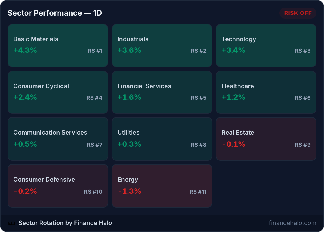
This is not a screenshot. The grid below is the actual embedded widget, served live:
Whatever day you read this, the tiles above show the market's current leaders and laggards, and the badge in the corner shows whether rotation currently favors risk-taking or defense.
What the Widget Shows: Returns, RS Ranks, and the Regime Signal
Each of the 11 tiles packs three data points, and the header adds a fourth that is unique to this widget:
| Element | What it tells you |
|---|---|
| 1-day return | How the sector performed today, with the tile tinted green or red by magnitude |
| RS rank (#1 to #11) | The sector's relative strength versus the other ten, so you see leadership, not just daily noise |
| Tile order | Sorted by relative strength: the strongest sectors always sit top-left |
| Risk-on / risk-off badge | A live rotation signal comparing cyclical versus defensive sector flows |
The badge is the differentiator. When money flows into cyclicals like Technology, Consumer Cyclical, and Industrials, the signal reads risk-on. When Utilities, Consumer Defensive, and Healthcare lead, it flips to risk-off, the classic defensive crouch. Most free heatmaps make you infer this yourself; here it is computed for you from the underlying rotation data.
How Do You Embed the Sector Heatmap?
Three steps, about 30 seconds:
- Open the Finance Halo widgets gallery.
- In the Sector Heatmap card, pick light or dark and click Copy code.
- Paste the snippet into your page where the heatmap should appear.
The snippet looks like this:
<!-- Sector performance heatmap - Finance Halo -->
<iframe src="https://financehalo.com/embed/sectors"
width="100%" height="430"
style="border:0;overflow:hidden;border-radius:12px;max-width:640px"
loading="lazy"
title="Sector performance heatmap - Finance Halo"></iframe>
<p style="font-size:12px">
<a href="https://financehalo.com/sectors">Sector rotation & performance data</a>
by <a href="https://financehalo.com">Finance Halo</a>
</p>Notes on the two parts:
- The iframe is responsive:
width="100%"fills your column, the tile grid reflows to the available width, and the grid stretches vertically to fill whatever height you give it. Add?theme=darkto the URL for the dark card. - The attribution line below the iframe is the license: keep it visible and the widget is free for personal and commercial use, no other conditions.
Adding It to WordPress, Ghost, Notion, and More
WordPress
Add a Custom HTML block in the editor, paste, preview, publish. The heatmap is wider than the chart and gauge widgets, so it shines in full-width sections and market-recap posts.
Ghost
Type /html, paste the snippet into the HTML card, publish. The widget appears on the web version of the post; email clients strip iframes, so link newsletter readers to the post.
Notion
Type /embed and paste the widget URL directly: https://financehalo.com/embed/sectors. Notion renders the live grid inline, including on public Notion pages, which makes it a neat addition to a shared market dashboard.
Squarespace, Wix, Webflow, and static HTML
Use the platform's Code or Embed block and paste the snippet as-is. Any surface that accepts HTML renders the heatmap.
How Do You Read Sector Rotation?
Sector rotation is the tendency of money to move between groups of stocks as the economic outlook shifts. The classic split is cyclicals versus defensives:
| Cyclical (risk-on) sectors | Defensive (risk-off) sectors |
|---|---|
| Technology | Utilities |
| Consumer Cyclical | Consumer Defensive |
| Industrials | Healthcare |
| Financial Services | Real Estate (rate-sensitive) |
| Basic Materials, Energy |
Three practical reads from the widget:
- Leadership tells the story. If Technology and Consumer Cyclical hold RS #1 and #2, the market is paying up for growth. If Utilities and Consumer Defensive climb the ranks, investors are hiding, a pattern worth cross-checking against the Fear & Greed Index.
- Divergence is a warning. An index near highs while defensives quietly take over the top ranks is a classic late-cycle tell. Rotation often turns before price does.
- Breadth confirms. A rally led by one sector is fragile; a rally where 8 of 11 sectors advance has legs. Pair the heatmap with an understanding of corrections versus bear markets to keep drawdowns in perspective.
Sector ETFs make rotation directly tradeable: each tile corresponds to a SPDR fund like XLK for Technology or XLE for Energy, so readers can go from your embedded heatmap to an actionable instrument in one step.
Alternatives: TradingView Heatmaps and Finviz Maps
Two well-known alternatives exist, and the honest answer is that they serve different jobs. TradingView's stock heatmap widget is a free, embeddable, interactive map of individual stocks sized by market cap, with TradingView branding on the free tier. Finviz has the most famous map on the web, but it is designed to be viewed on finviz.com: there is no official embed widget, so sites end up pasting static screenshots that age immediately.
| Finance Halo sector widget | TradingView stock heatmap | Finviz map screenshot | |
|---|---|---|---|
| Granularity | 11 sectors, RS-ranked | Individual stocks by market cap | Individual stocks |
| Risk-on / risk-off signal | Yes, computed live | No | No |
| Live when embedded | Yes, 5-minute refresh | Yes | No, static image |
| Page weight | Few KB, server-rendered, lazy-loaded | Interactive JS widget | Image weight |
| Branding | One attribution link | TradingView logo and links | Finviz watermark |
Pick TradingView when readers should explore individual stocks inside the map. Pick this widget when you want the fast, scannable sector story, who leads, who lags, and which way rotation points, at the page weight of an image.
What Readers Get When They Click Through
The attribution link leads to the full sector performance page, which extends the widget into a complete rotation dashboard: market regime, advancing versus declining counts, 1-day, 5-day, and 20-day returns, breadth per sector, and an industry-level drill-down inside each sector.
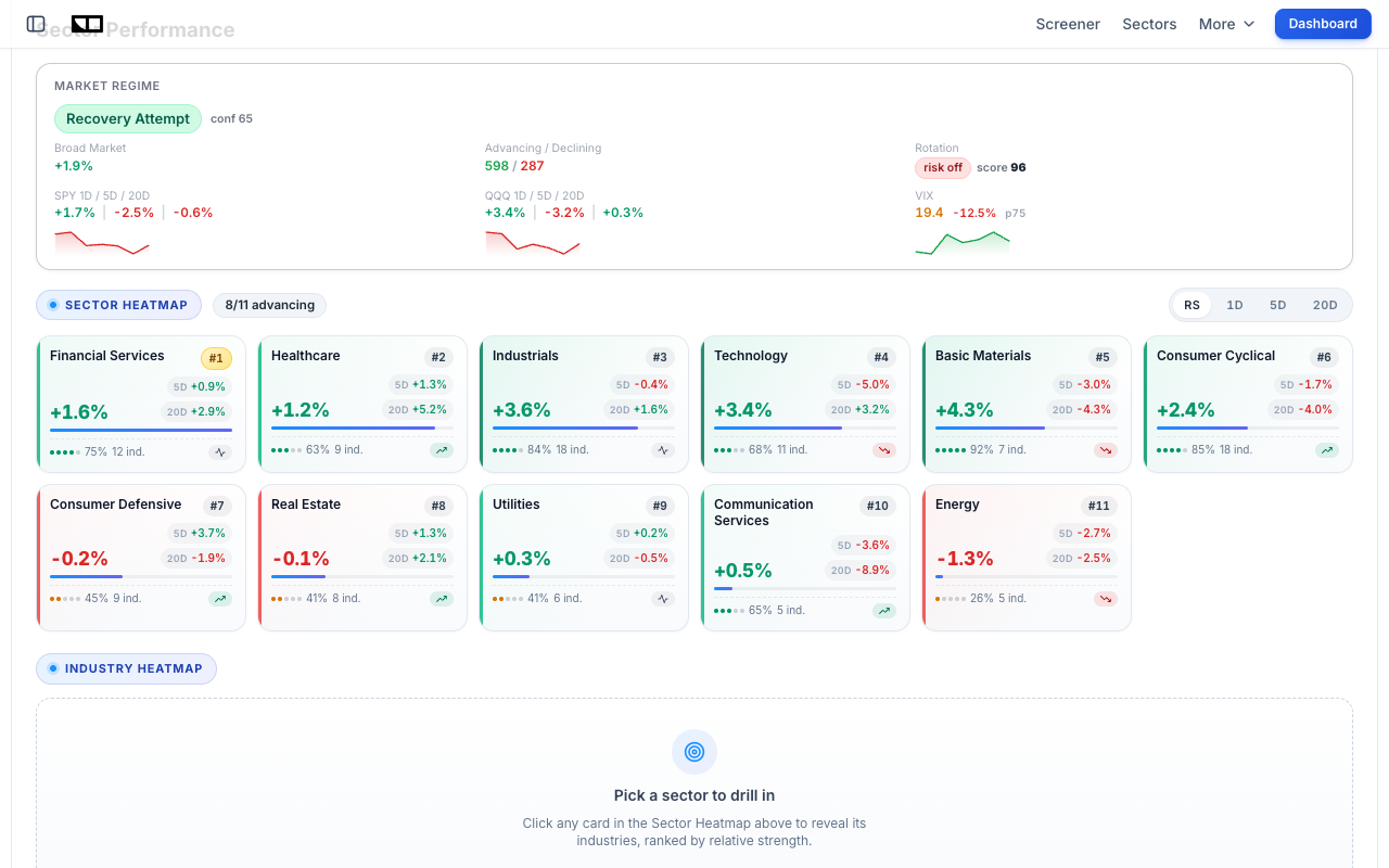
So embedding the widget gives your readers a path, not a dead end: heatmap on your page, full rotation analysis one click away, and from there the daily AI market intelligence report that interprets what the rotation means. If your content leans stock-picking, the free market screener closes the loop from sector strength to individual candidates.
Common Mistakes to Avoid
- Removing the attribution link. It is the only condition of free use. Keep it visible and unmodified.
- Pasting into a rich-text field. Use the HTML or embed block of your platform, or readers will see escaped code instead of a heatmap.
- Making it too narrow. Below roughly 300 pixels the grid collapses to fewer columns and gets tall. Give it a full-width section or a wide column;
max-width:640pxkeeps it tidy on large screens. - Cropping the height. Keep the iframe at 400 pixels or more so all 11 tiles and the footer stay visible without scrolling.
- Treating one red day as a regime change. Rotation signals are about persistent leadership, not single sessions. Watch the RS ranks over days, not hours.
- Expecting it in email. Iframes do not render in email clients. Embed on your site and link from the newsletter.
Frequently Asked Questions
Is the sector heatmap widget really free?
Yes. No account, no API key, no usage caps, and commercial use is allowed. The single condition is keeping the attribution link in the embed code visible and unmodified.
How often does the heatmap update?
The underlying sector data refreshes throughout the trading day and embedded widgets pick it up within minutes via a 5-minute cache. You never need to touch the embed again.
What do the RS ranks mean?
RS stands for relative strength: sectors are ranked #1 to #11 by performance relative to each other, so you can separate durable leadership from one-day noise. The grid is sorted by this rank, strongest first.
What does the risk-on / risk-off badge mean?
It is a live rotation signal comparing flows into cyclical sectors versus defensive ones. Risk-on means cyclicals lead and the market is embracing risk; risk-off means defensives lead and investors are positioning cautiously.
Is there a dark mode?
Yes. Add ?theme=dark to the widget URL or flip the theme selector in the gallery's code generator. The dark card sits naturally on dark sites with no custom CSS.
Does the widget slow my site down?
No. It is a few kilobytes of server-rendered HTML with no JavaScript library, and the snippet ships with loading="lazy" so it loads only when the reader scrolls to it.
Can I embed the individual sector ETFs too?
Yes, with the companion chart widget: embed a live price chart for any sector ETF like XLK or XLE using the free stock chart widget from the same gallery.
Conclusion
A free sector heatmap widget turns any market commentary page into a live dashboard: all 11 S&P sectors, color-coded returns, relative-strength ranks, and a risk-on / risk-off signal that most paid tools do not surface, all for one copy-paste snippet and an attribution link. It is lighter than TradingView's interactive maps, and unlike a Finviz screenshot it never goes stale. Together with the Fear & Greed gauge and the live stock chart widget, it completes a free, zero-maintenance market data kit for any finance website.
Try it yourself: Grab the free sector heatmap widget for your site, and use Finance Halo's AI assistant to get instant analysis on any stock. Just type a ticker and ask your question.
Disclaimer: This article is for educational purposes only and does not constitute investment advice. Always do your own research before making investment decisions.